Your cart is empty
Featured
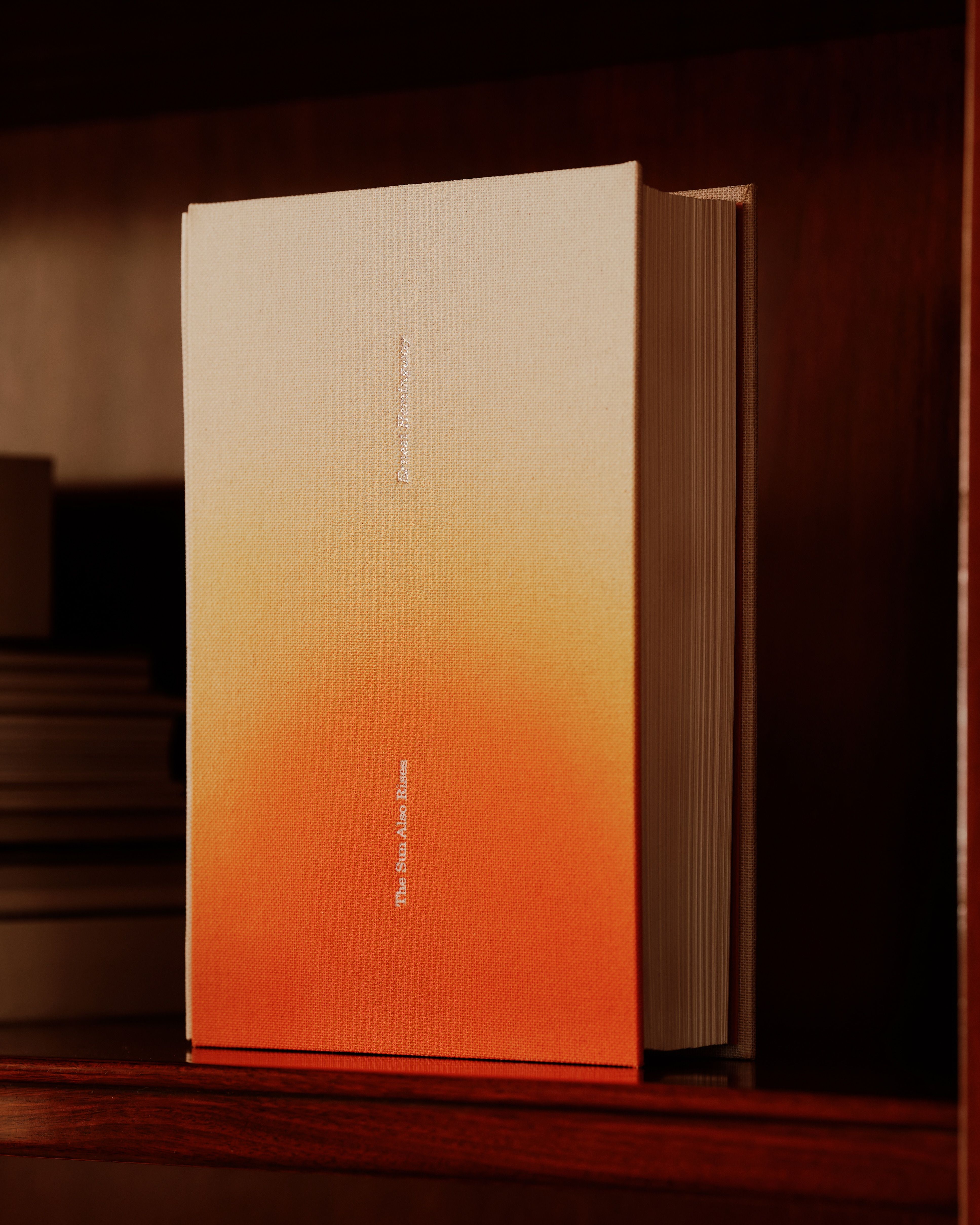
The Sun Also Rises
Ernest Hemingway
Released: 2026
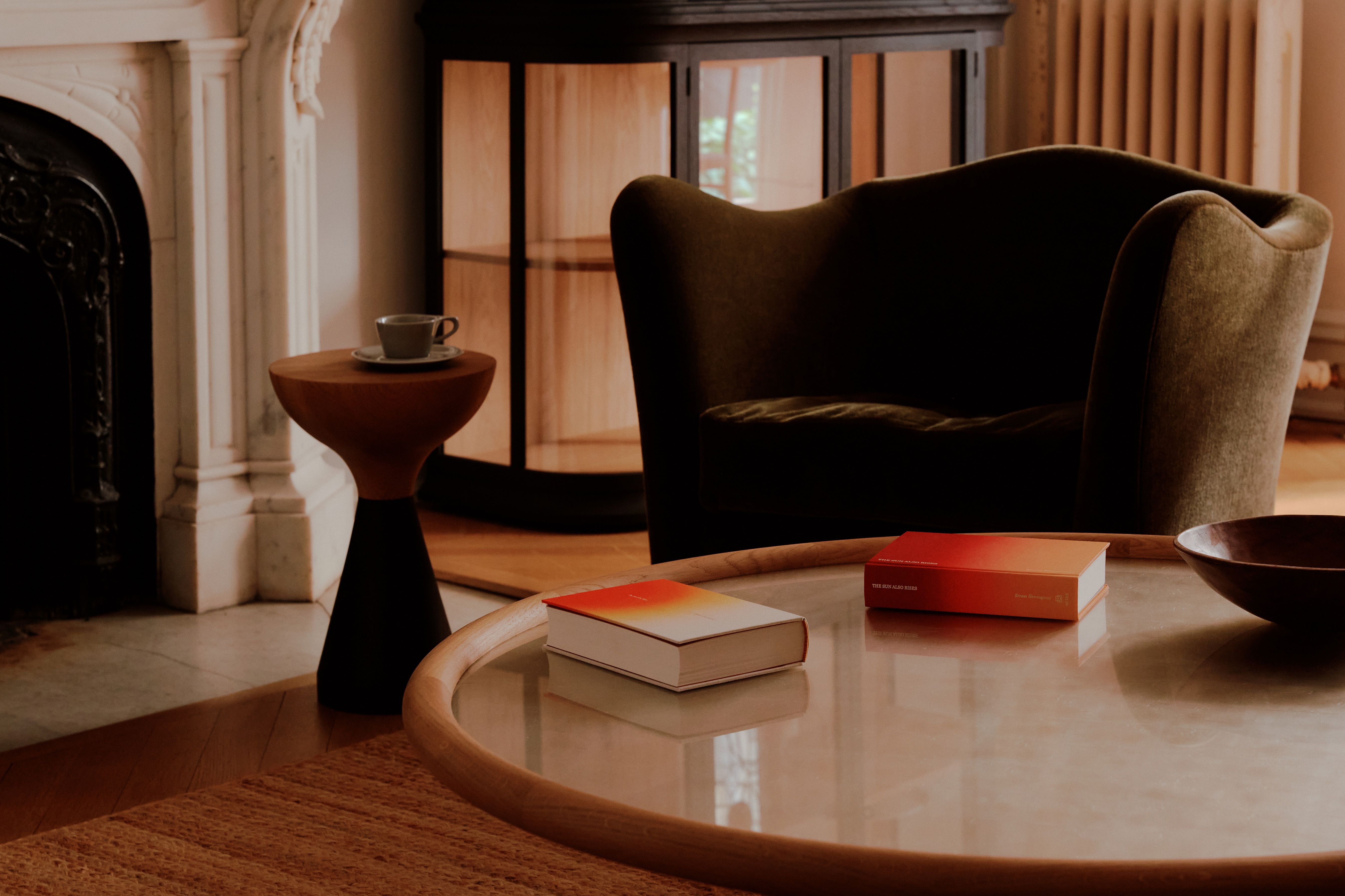
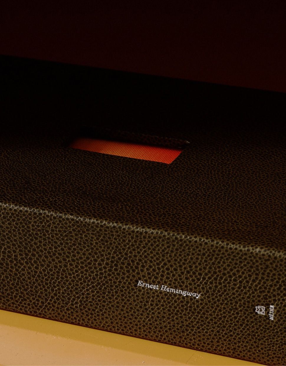
This edition of 26 copies are Bradel bound by fine bookbinder Lorna McCurdy, and feature hand-crafted tonal silk head and tail bands. These books will come in leather-wrapped clamshell cases with a unique aperture highlighting the striking color gradient of the hand-painted cover. The cases are constructed using Taurillion leather from the historic Rémy Carriat tannery in France, where iconic ateliers have sourced their goods for decades.
1 / 9
2 / 9

3 / 9
4 / 9
Binding
Hand bound by bookbinder Lorna McCurdy in the UK, each lettered edition has been painstakingly constructed using traditional fine methods and tools. The folding sewing, and casing have been done completely by hand, and every copy is wrapped in a natural linen bookcloth which has been individually hand painted, making each book a one of one.
These books feature a Bradel binding with archival details and materials, capped at each end with silk endbands. The head and tail bands vary slightly in color from one another, mirroring the tonal transition of the cover design. Each one has been wrapped by hand using multiple colors, which achieves a unique ombre color quality.
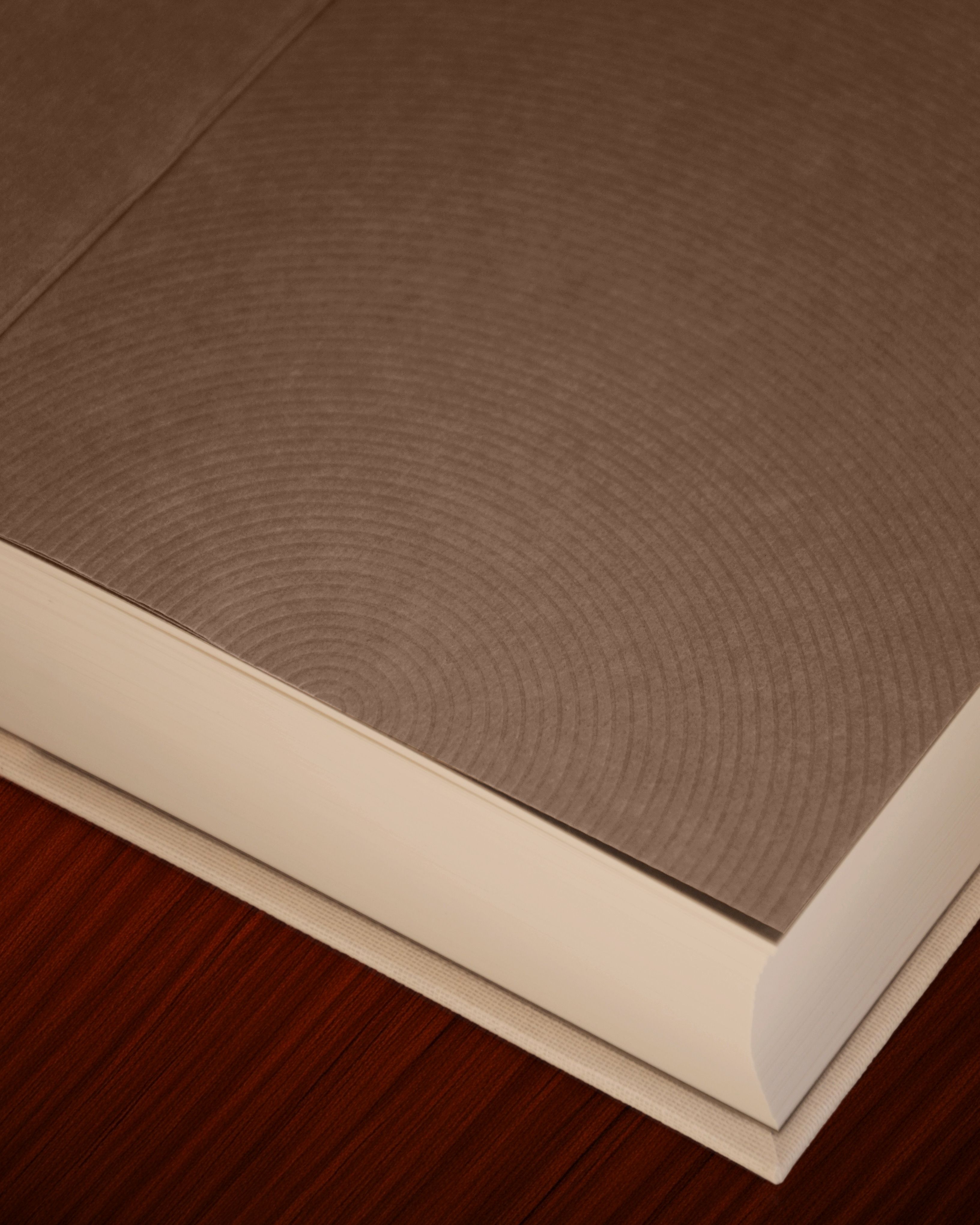
The endsheets are a multi-leaf construction—a practice employed in the rare and antiquarian world—using mould made Hahnemuhle Bugra paper from Germany, which have been blind stamped with a concentric ray pattern.
No detail has been overlooked with this edition, a keen eye will note the endsheet paste downs have been filled in, creating a beautifully smooth transition from turn in to interior cover.
5 / 9
6 / 9
7 / 9
Case
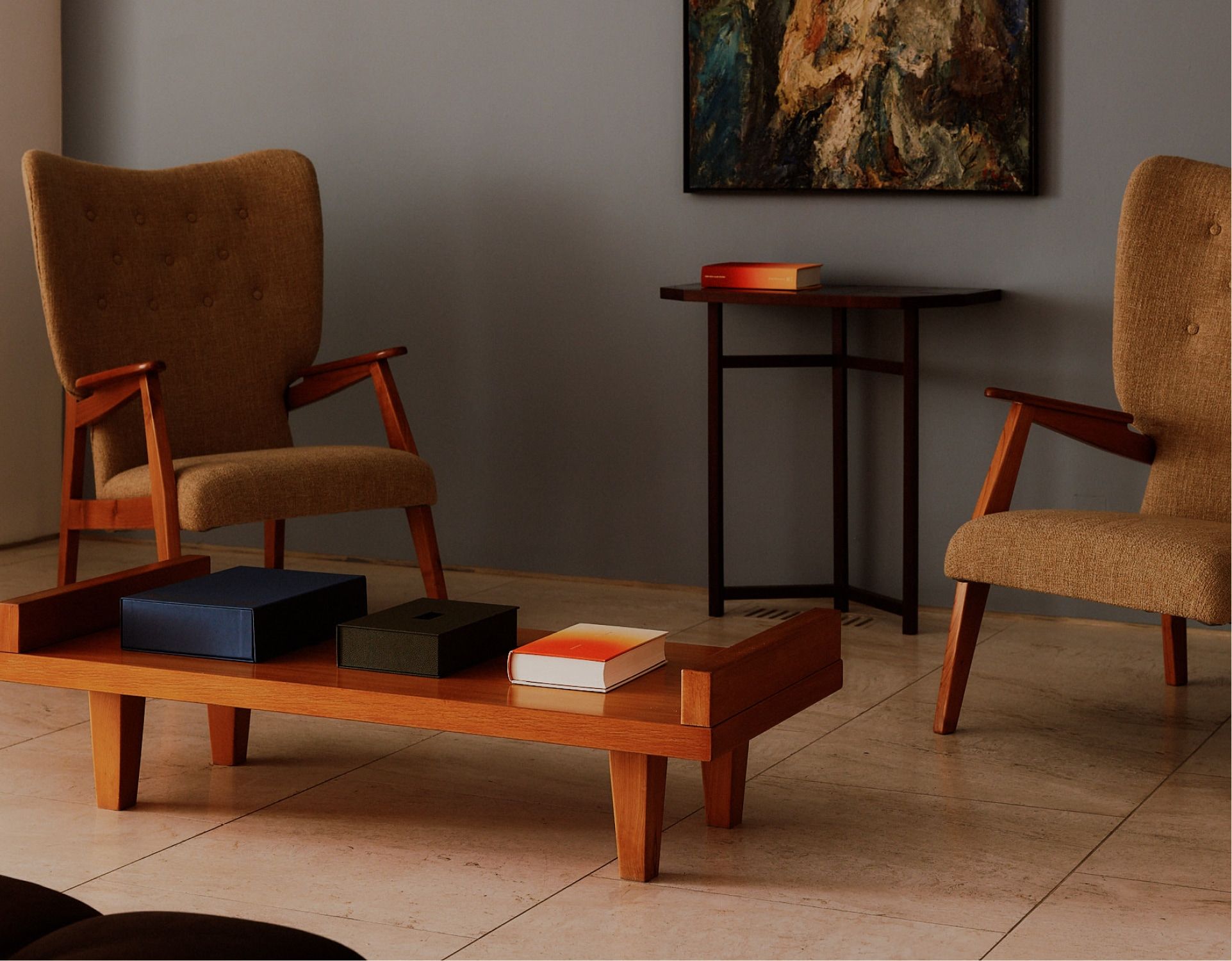
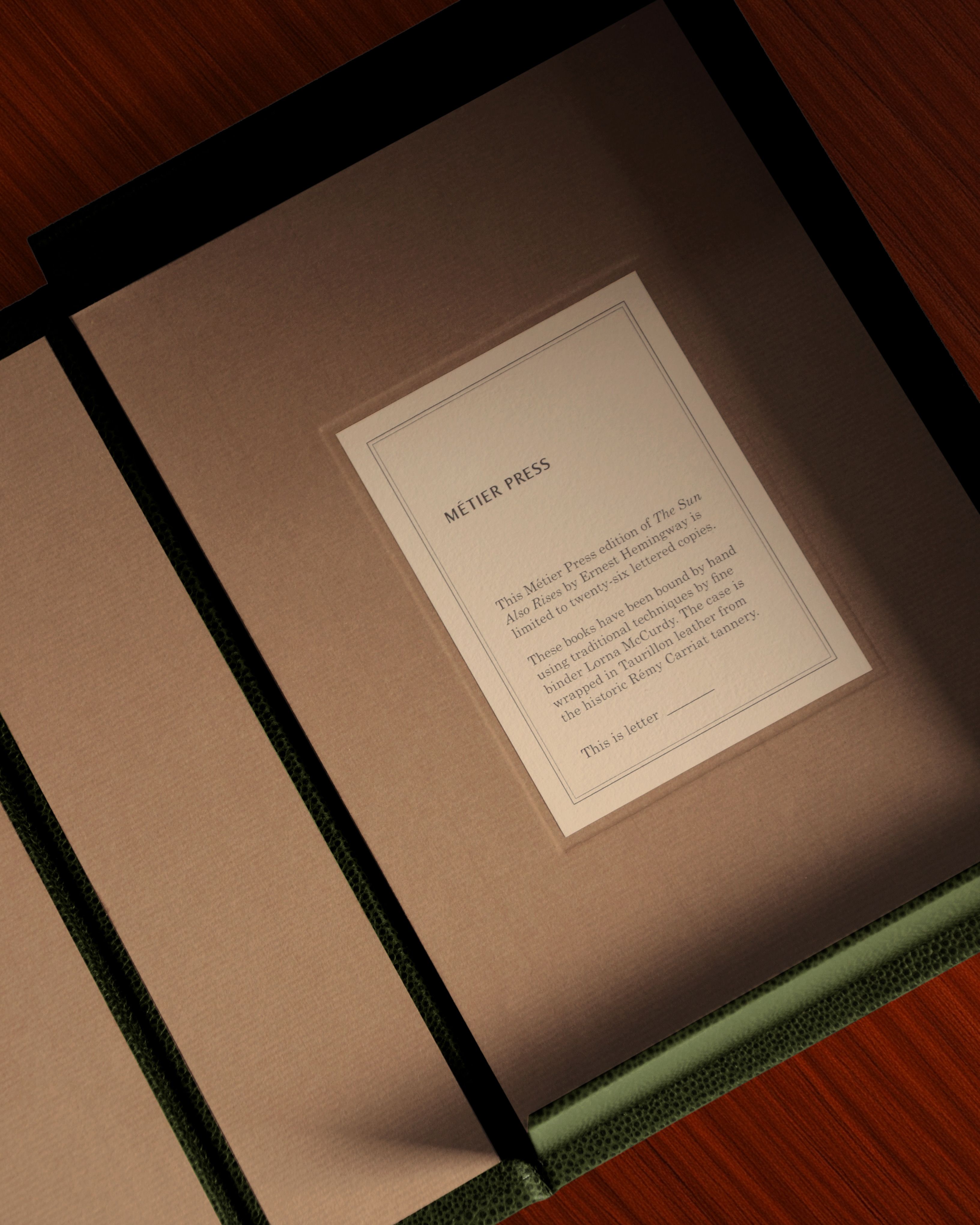
These books come in a handmade clamshell case with a unique aperture window that showcases the hand-painted ombre of the cover. They are wrapped in an exceedingly fine leather sourced from the historic Rémy Carriat tannery in France, who has supplied historic ateliers for over a century.
The interior of the cases are lined with mould made acid free Hahnmuhle Bugra paper to protect the book's longevity, and feature handmade labels denoting each unique edition number.
8 / 9
Printing
There is nothing scalable about the fine processes employed in the making of our books. Where mass-produced books can be made in minutes, each copy of a Métier title takes years to produce.
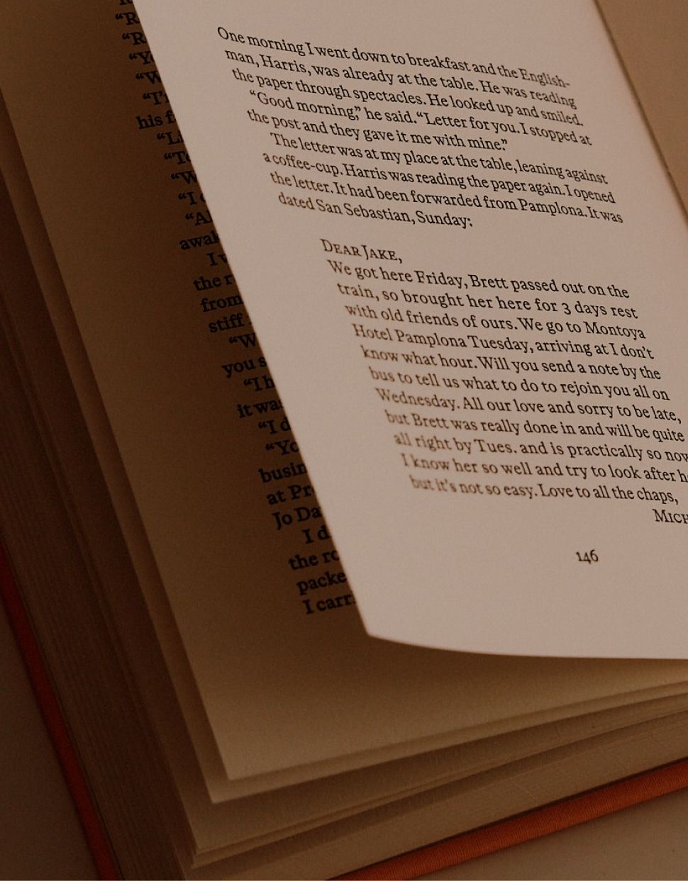
This book was printed letterpress on a Heidelberg cylinder, leaving a physical impression that cannot be produced via offset or digital methods. Like the inimitable sound of vinyl records or the analog precision of a Swiss watch movement, the mark of letterpress printed page offers a truly unique experience, adding an almost sculptural element which can be both seen and felt.
This printing was completed by the Ascensius Press, who have produced fine press for over three decades, and whose work can be found in preeminent private libraries and institutional collections.
The books are printed on Fabriano Tiepolo, a 130 gsm mould made paper from Fabriano, the oldest mill in Europe. We're in good company—Fabriano is not only the birthplace of the watermark and an epicenter of artisanal paper making, but also happens to have been a favorite of Michelangelo and Beethoven.
9 / 9
Design
We've typeset this edition in Otto, a typeface designed by Sam de Groot and Laura Opsomer Mironov for acclaimed modern foundry Dinamo.
Specifically designed for reading, Otto is an irreverent mix of modern and traditional tenets that blends the Dutch style Baroque serif genre with a decidedly ahistorical rounded evenness and larger x-height.
Brijan Powell is the creative tour de force behind our books' designs. A deeply talented and highly sought after graphic designer whose work is at once both timeless and timely, Brijan has applied his acumen and taste across a wide breadth of media. Foundations of the editorial design were established by Geoff Halber, a Yale School of Art graduate who has worked with a wide breadth of notable imprints and institutions.